Digital Prison Services
From March 2017 I began working for Syscon Justice Systems and with HMPPS (Her Majesty’s Prison and Probation Service) on a replacement for the main system that manages prisons, called NOMIS. Syscon worked on the original version, which was launched in around 2009, and has been asked to help rethink the entire system in conjunction with HMPPS.
Initially the replacement, later renamed to Digital Prison Services (DPS), was intended to be trialled on mobile devices but we expanded the work to include desktops. The services we have designed all run in browser and are fully responsive, whilst all of our users are either using desktop machines or laptops at present.
As well as working on the main prisoner search and profile screens I also designed a service to allow staff to generate and print ‘unlock’ lists for when the prisoners are leaving the wings and heading off to their daily activities. In addition, the team worked on a service to allow staff to move prisoners from one cell to another.
During the early stages of the Covid-19 pandemic we quickly responded to the needs of the prison service by creating a service to track which prisoners were isolating, who had newly arrived at the prison and who had decided to opt out of shielding.
I have been out on well over 120 prison visits in the past few years and have been heavily involved in research activities. My main focus has been on interaction design but I have also carried out various elements of service design when we have been without a dedicated service designer on our teams.
My most recent focus, since 2022 when I started contracting directly with HMPPS (leaving Syscon), was the redesign of the main prisoner profile page and the DPS home page from which all service users navigate to their chosen sub-area. Our team has also worked to ensure consistency across all DPS services with a single header and footer design that we rolled out in conjunction with other teams.

This is the most recent design of the DPS home page, which is the page that all users of the service land on before navigating to the area of the system they are working on.
I designed the original version (see below) back in 2017 and it was satisfying to get the chance to return to it and improve it.
We restyled the service navigation section and took inspiration from pages on GOV.UK. We also added a ‘Learn more’ section at the top which links to a page explaining how and why we’re replacing the legacy system that some staff are still using.
The ‘Today in…’ section is our first attempt to add real time status information to the home page, customised for the particular prison that the user is in. This section will be expanded and improved over the coming months and years.
We also took the opportunity to add a ‘What’s new’ section to the home page that gives quick summaries of recently updated features and links to learn more.
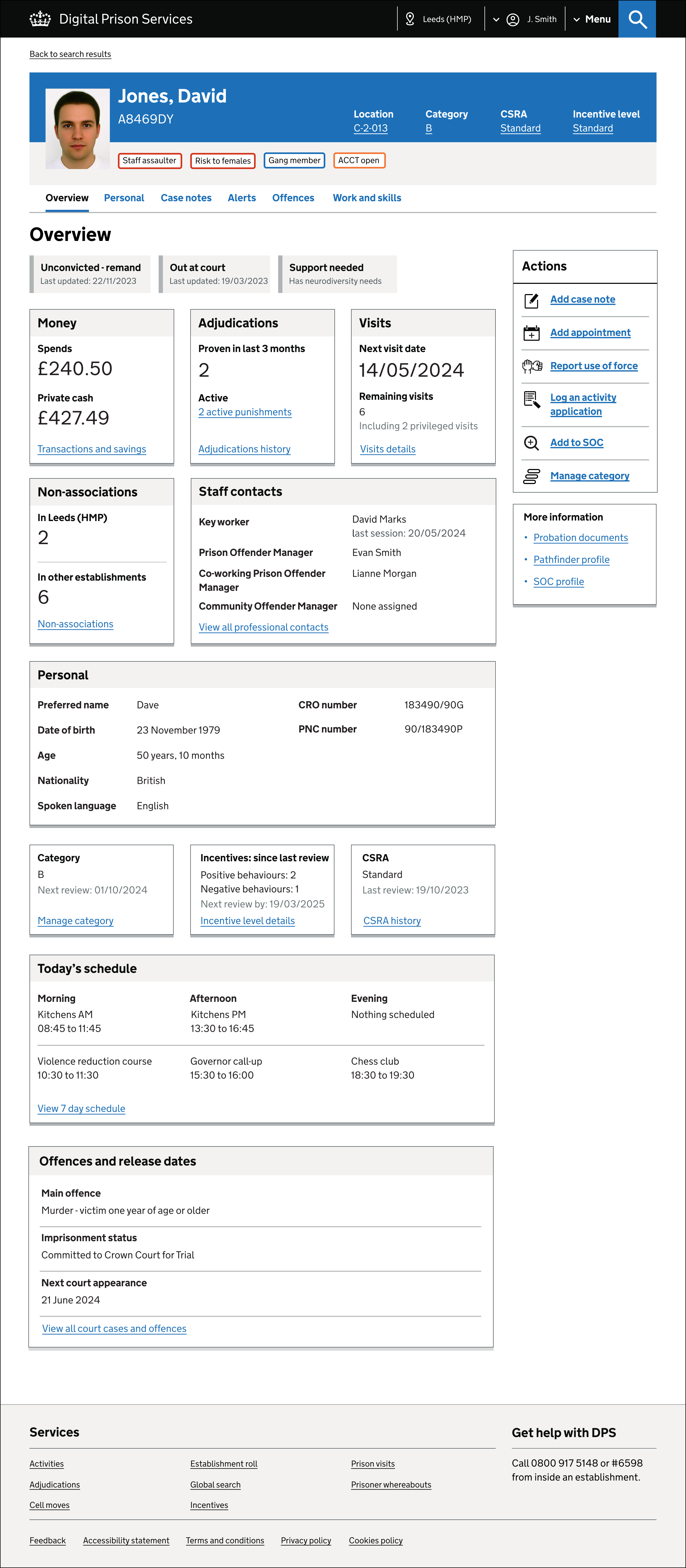
This is the most recent (2023-2024) design of the main prisoner profile page. See below for the original design which I also worked on between 2017 and 2018.
The redesign was initiated to ensure that the profile is scalable for the future and has a UI that is modular and will allow for more user customisation in the future, for example showing different elements in different orders depending on the role of the person using it.
We decided to use the ‘Summary cards’ pattern that is found in the GDS design system as it worked really well in terms of being able to display a wide range of key information on the Overview page, without us having to use the tables seen on the original design below.
We also settled on using icons for the actions list after doing extensive user testing with and without them. We were able to prove that having them present helped users find the actions section quickly and they allowed it to stand out on a page with a lot of text and grey backgrounds.
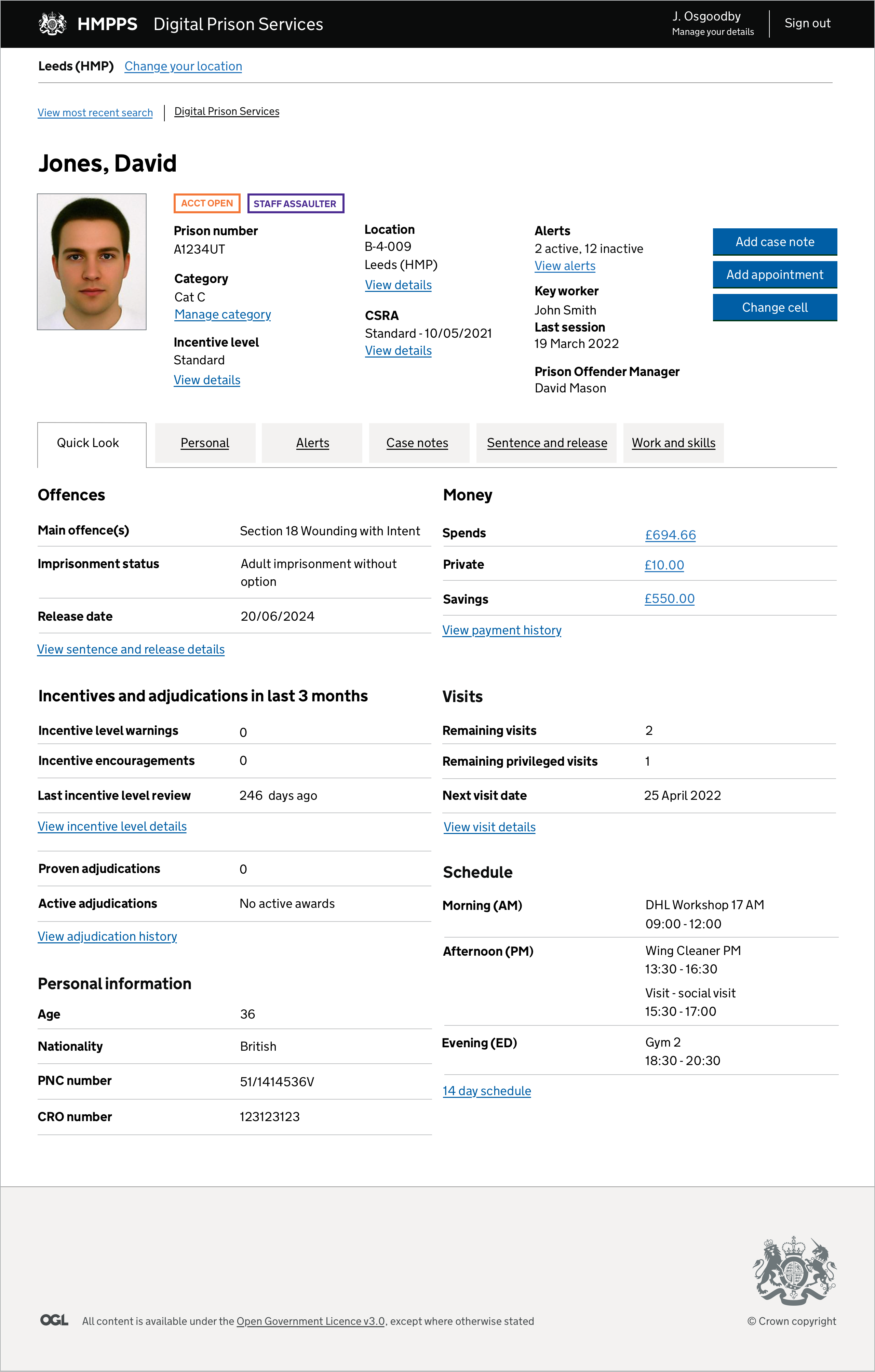
This is the original prisoner profile which evolved several times since 2017 and was completely redesigned starting in 2022.
The original version was created to allow staff to see the key information about a prisoner in one go, versus the older system where the data was spread across multiple sections. The tabs are used to separate key information, such as case notes and alerts.
The key issue with this version was that we had to keep adding more information to it as new DPS services were created and it started to become unwieldy. This was particularly acute with things like the action buttons (which were blue to differentiate them from the classic green action button).

This is an example of a user flow I created in conjunction with stakeholders and end users to understand that current process ‘as is’ for a DPS service called ‘Whereabouts’ that I worked on. I created several such flows I’ve created over the past few years.

This is an example of how the switch to a web-based, responsive layout can dramatically improve the readability of information, in this case the alerts details of a prisoner. Whilst tables aren’t always the ideal pattern to use, we have several sections in DPS for which they make sense. We also don’t have any users who are on mobile devices or tablets so the width of the screen is less of a consideration.

The prisoner search results page also vastly improves on the original NOMIS version. We were able to add larger photos, more key information and the ability to reorder the results, plus view the results as larger prisoner photos if a users is not sure of the name but recognises the face. The coloured ‘flags’ on the right are used to highlight particular risk-based alerts that staff should know about the individual.
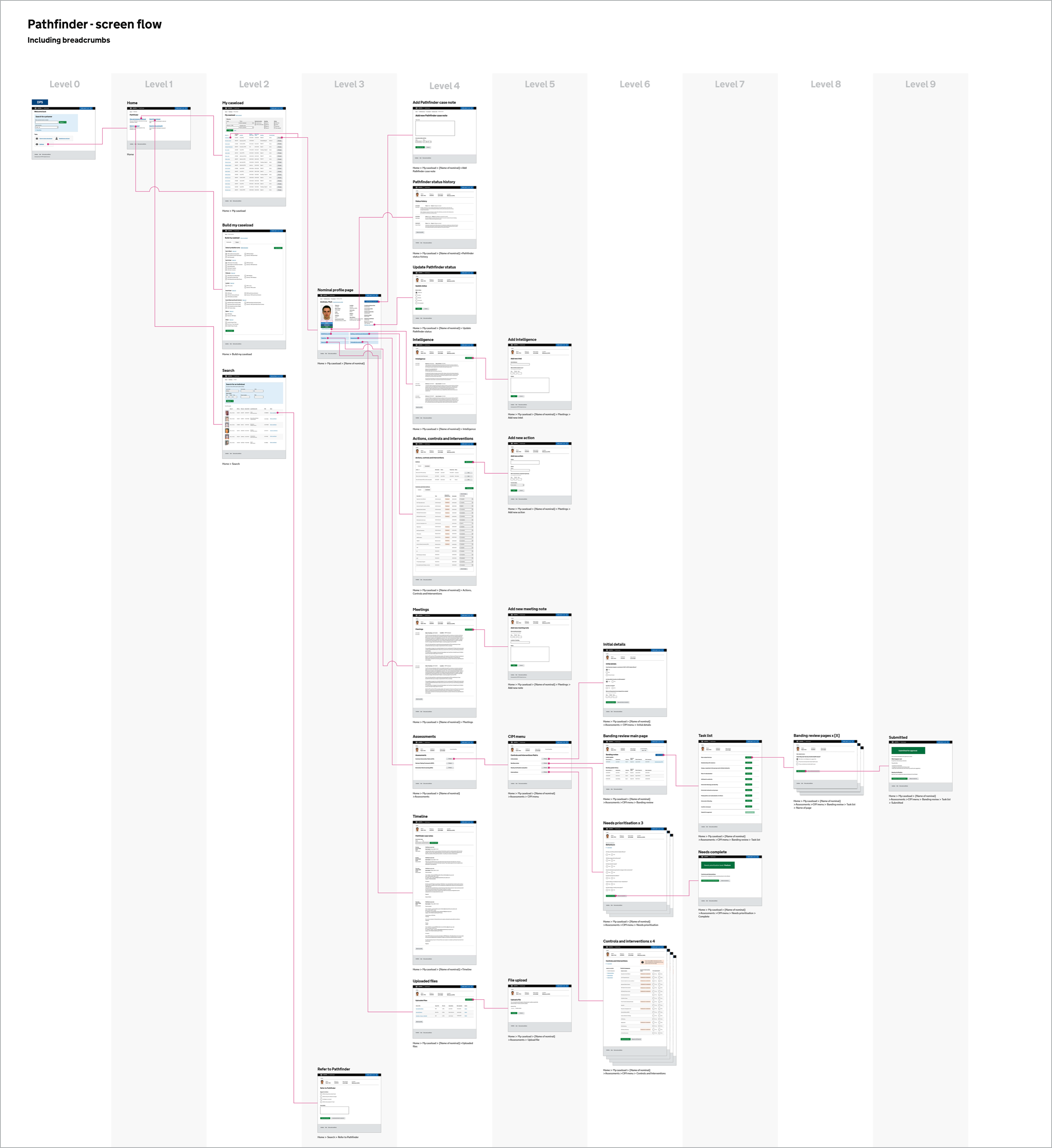
This is an example of how I have used ‘levels’ to show the screen flow of DPS services, in this case one called Pathfinder. It helps colleagues and stakeholders understand the scale of the service and the ‘depth’ of particular sections.
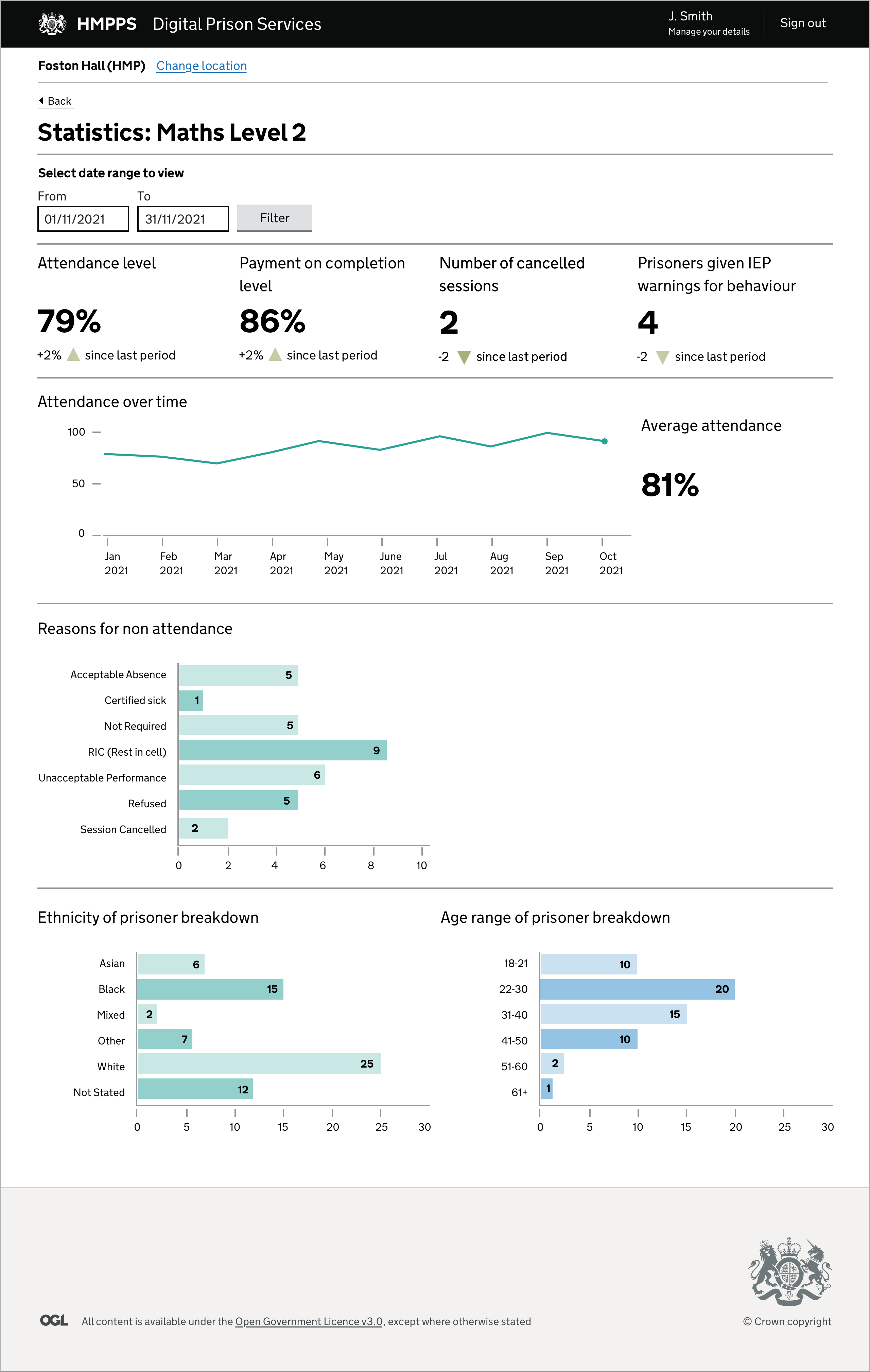
This is a prototype of a stats page I worked on for the ‘Whereabouts’ section of DPS. There are lots of existing reports that staff use to monitor things like the progress of prisoners and the performance of a particular area of the prison, but these tend to be spreadsheet based. We have started to create these live ‘dashboard’ views since they are constantly updating, much easier to read and can be accessed by more staff.
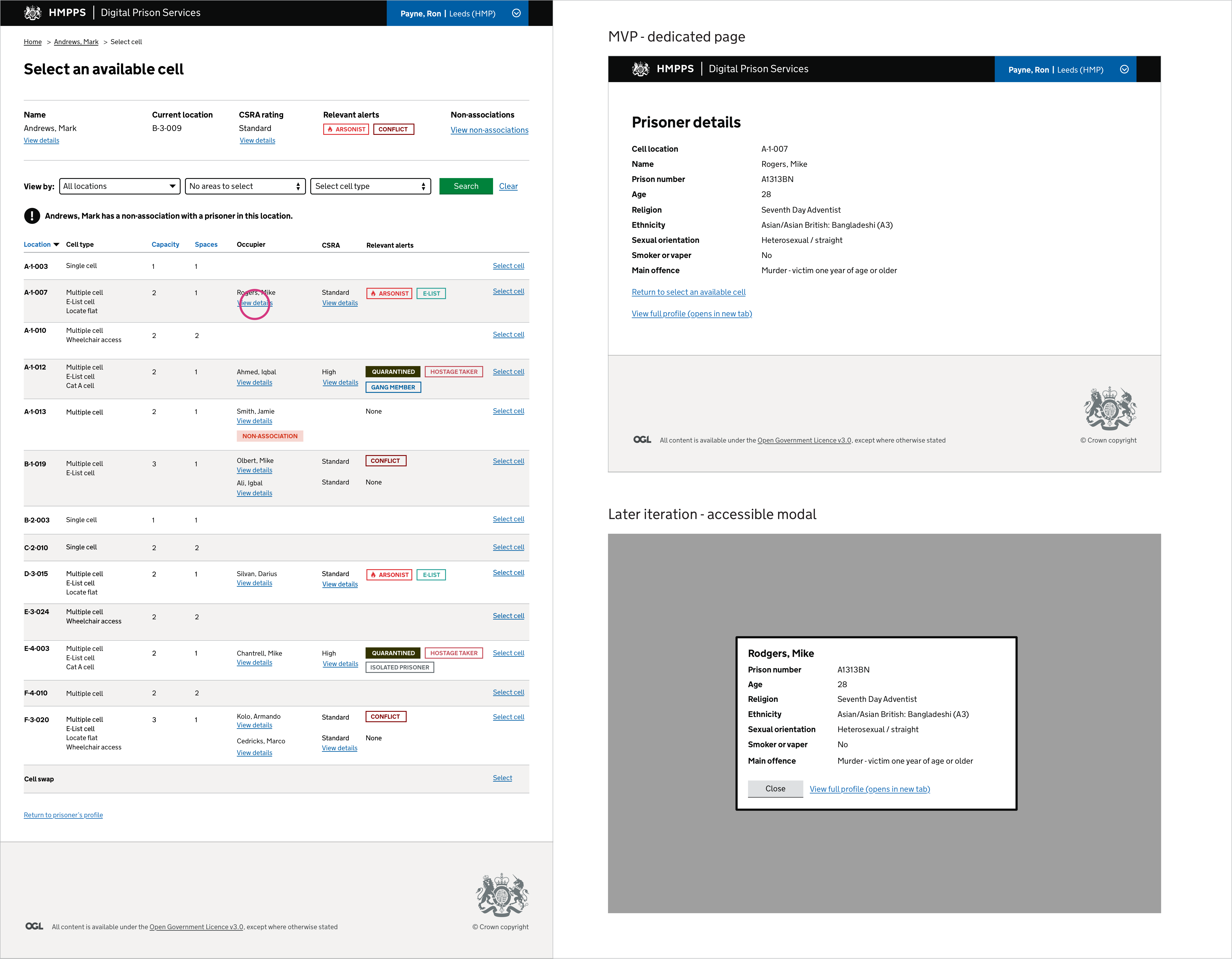
An example of how pages can evolve beyond their initial MVP (Minimum Viable Product) version. This cell moves ‘Select an available’ is fairly dense with information but we worked hard to only include the necessary details on there. For more key information, such as the other prisoners’ details, we decided to have them accessible via a link. The MVP version opens a separate page with the information but this does break up the flow of the journey somewhat, so we have developed an accessible modal overlay for the same information which will be implemented in a future release.

This diagram was used to keep a track of what screens were being developed for each phase of a particular service, including what evolves with each release. This helps the entire team keep a track of what has been completed and what is still to be developed, as well as what still needs to be user tested.
